NouriPet
UX Design and Research, Visual Design & Branding for pet nutritional mobile app.
NouriPet is a Pet Nutrition Tracking and Pet Food Delivery App that aims to offer a complete experience to keep your furry friends healthy with tailored food recommendations, helpful tips and efficient reminders!

THE CHALLENGE
The goal of this project is to establish a design system for a mobile app, developing the core UX Design and functionalities, as well as developing the brand's image.
CREATE A COHESIVE DESIGN SYSTEM
DEVELOP A BRAND AND LOGO FOR NOURIPET
CREATE A FUNCTIONAL ACCESSIBLE APP
UNDERSTAND AND ASSESS OUR USERS' NEEDS
OUR AUDIENCE
Our users are dog and cat owners based in the UK aged 18-70 with a medium socio-economic status who want to keep track of their pets' health and buy the best pet food according to their needs through their phones.
As the development of this project entailed a deep understanding of our audience, we opted for qualitative research. We conducted a series of interviews with potential users to determine the details of our client base and understand their needs and problems with similar apps.
How does pet nutrition tracking impact your daily life?
What nutritional values would you like to see in the app?
What was your experience with other nutritional tracking apps?
When and where would you access this service?
PAIN POINTS
1
Food is stolen or delivered when nobody is home.
2
I can track my pet diet but I can't buy food from the app.
3
App is too complicated and tedious to use.
4
App text is hard to see and there is a lot of clutter.
CONCLUSIONS
According to the research, we established two distinct user groups.
-
Busy young professionals who work odd hours and need to be able to get pet food delivered on specific dates
-
Old people with mild visual impairment that wish to learn more about their furry companions while keeping them healthy.
RACHEL HANSEN

Age / 31
Occupation / Midwife
Location / London
Pet / 1 cat
Rachel is midwife in London. Her shifts get a little bit crazy sometimes, but she still has time to spend with her cat Choc. As a health professional, she feels the need to keep good track of her pet’s nutritional habits and ordering the food that best suits its diet. It gets very frustrating when this processes take a long time, since she's very busy, or if the food gets stolen from her door because she wasn’t there to receive it!
JAVIER HERNÁNDEZ

Age / 64
Occupation / Retired
Location / Bracknell
Pet / 3 dogs
Javier retired early after working for many years in his company. Now he has the time to enjoy long walks with his dogs and wife. He’s interested in learning more about his dogs' needs and how to feed them properly. He has a hard time when updates change everything around. The colours are also very soft and it’s hard to see the icons. He would like for the whole process to be easier to understand, more simple and fast.
PROBLEM STATEMENTS
In compliance with previous findings, we reached the following conclusions:
Rachel Hansen is a busy professional and pet owner who needs to get pet food that suits her cat's diet delivered on specific dates because she cares about her pets nutrition and is not always home to receive the delivery.
Javier Hernández is a retired pet owner who needs a visually-accessible simple app where he can learn more about his dogs because he has poor eyesight, is not particularly tech-savvy and wants to keep his pets happy .
USER JOURNEY
Here we can find an example of Rachel Hansen's journey to place an order in the app.

OUR COMPETITORS
We run a competitive audit to find out more about our main competitors and how their pet profiles are. Their strengths rely on their wide range or nutritional and health related trackable values, having multiple types of pets, and having integrated systems for veterinary documentation. Their weakness lie in their poor branding, tedious navigation and lack of accessibility options. None of them offer pet food delivery.

DuePet

My Pet

Pawprint

RVC Pet Diabetes
IDEATION
Taking into account the previous data, we began the wireframing process. From multiple paper wireframes exploring the possible layouts, to a digital low-fidelity prototype.

Design series of 6 possible layouts for the product page of the app and a refined version.

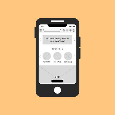
Hub & Spoke Home screen, navigation menu with all the sections and tips articles to keep users up to date with the latest advice.

These mockups include a calendar where the user can select specific dates an hours to receive their parcel.
Design series of 6 possible layouts for the product page of the app and a refined version.
We decided to focus on developing a strong image and branding, creating a simple, accessible, easy-to-navigate app with food recommendations related to the pet's profile details, and establishing a complete journey from the pet profiles to the shop.
USABILITY STUDY
We conducted a usability study with 5 participants that met our criteria to find out if they main flow of the app was easy to understand and follow, and to identify possible pain points along the way.
GOAL
Figure out if the app is intuitive, easy to understand structure-wise and find possible user pain points in the Pet Profile related pages and shopping journey.
KPIs
Task Success Rate (TSR)
User Error Rates
Drop-off rates
METHODOLOGY
Remote supervised study with 5 participants (individual sessions) where the users were asked to complete the following prompts:
-
Create a pet profile
-
Complete a purchase
-
Go to an existing pet profile, check the food recommendations and make a purchase of one of the products in said category.
Sessions can last up to 1 hour.
THEMES & INSIGHTS
The following were the most prevalent pain points.
-
Most users had problems editing their orders at the summary stage.
-
Most users complained about not being able to select pet type (cat or dog).
-
All users had problems with the calendar and found some information missing.
-
Most users didn't notice horizontal scrolls without a visual cue.
CHANGES
Based on the themes we applied the edited the following features.
-
Product edition was removed at summary stage to avoid confusion and changing the other parameters.
-
Personal details edition now triggers its own pop up where the user will be able to do any corrections and then return to the summary.
-
For legal reasons, the payment method selection is now the last step of the checkout process.
-
The first step of pet profile creation is now a screen where the user will decide if their pet is either a cat or a dog. Fields and icons inside the profile have also been change accordingly to match the type of pet selected.
-
The calendar was enlarged, the text is now bigger, making it easier to read.
-
The monthly date was added to the weekly date.
-
A slide bar was added at the bottom of the calendar as a visual cue for the horizontal scroll.
-
The total cost of the order, as well as the shipping cost, has been added to the calendar screen.
-
Arrows were added to horizontal scrolls sections across the app as a visual cue.
RECOMMENDATIONS
There were other important aspects that also required to be worked on.
-
Some users suggested having an order summary after purchase would be convenient. It would be good to add a link to users' orders so clients can easily locate their order and educate them about the existence of this page.
-
Other parts of the app should be tested in future studies (Tips, Reminders, User Profile).
-
Once the basic features work, it's important to keep accessibility in mind for the following steps.


VISUAL DESIGN & BRANDING
The image of the brand is approachable and cute, yet reliable, with a tendency to rounded features.
LOGO
The logo depicts a snout (common to both cats and dogs) and a mouth (nutrition) with a heart nose (health, happiness, wellness).


ICONS
Common elements were reused throughout the app for coherence and to reinforce the brand's visual identity.
COLOUR PALETTE
The colour palette is an extension of the logo, leaning slightly towards the warmer side, with an efficient mix of creams, purples and pinks.


OTHER ELEMENTS
The fonts chosen for the app are Baloo for main titles and buttons and Inter for body text and secondary titles.
HIGH FIDELITY PROTOTYPE
ACCESSIBILITY
Accessibility is an important matter, as one of our main user groups has mild visual impairment. The colour palette is compliant with WCAG AA standards. Text has a established hierarchy that will help screen readers. Icons are widely used throughout the app to improve recognition.

TAKEAWAYS
The main challenge was organising all the different functionalities in an intuitive and clear flow, interconnecting the features. Some of the services, although related, needed their own space, as they were too complex too fuse.
I learned a lot from the usability study, and managed to identify and fix some important key pain points. Finding a colour palette that is both respectful and iconic was challenging, as the standards are pretty strict.
After finishing this whole project, I will definitely be changing my method to define the most important aspects early in the process, like text hierarchy, buttons and colours.
NEXT STEPS
Mirror versions of the app will be developed for high-contrast WCAG AAA standards and well as for colour blind users. Secondary parts of the app need to polished (log ins, subpages, etc.) and onboarding screens will be created.